
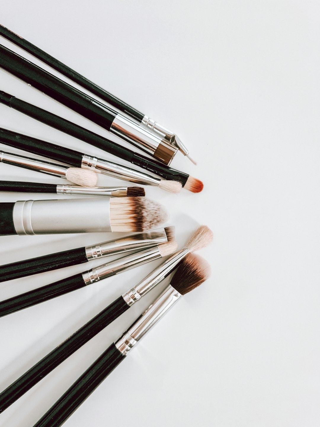
When most people think of makeup artistry, they imagine technical skills like blending eyeshadow or creating the perfect winged liner. However, what truly separates amateur makeup application from the work of a professional visagiste is a deep understanding of color theory. As someone who has worked in the beauty industry for over fifteen years, I can confidently say that mastering color theory has been the single most important factor in elevating my makeup artistry.
In this comprehensive guide, I'll demystify color theory for makeup application and show you how understanding these principles can transform your approach to beauty.
The Foundation: Understanding the Color Wheel
At the heart of color theory lies the color wheel—a visual representation of color relationships that has been guiding artists for centuries. For makeup artistry, understanding the basic structure of the color wheel is essential:
- Primary Colors: Red, yellow, and blue—the three colors that cannot be created by mixing other colors
- Secondary Colors: Orange, green, and purple—created by mixing two primary colors
- Tertiary Colors: The six colors formed by mixing primary and secondary colors (red-orange, yellow-orange, yellow-green, blue-green, blue-purple, red-purple)
While this might seem like elementary art class information, understanding these relationships is the first step in making intentional, sophisticated color choices in your makeup applications.
Color Relationships in Makeup Application
Professional visagistes leverage specific color relationships to create different effects in makeup:
1. Complementary Colors
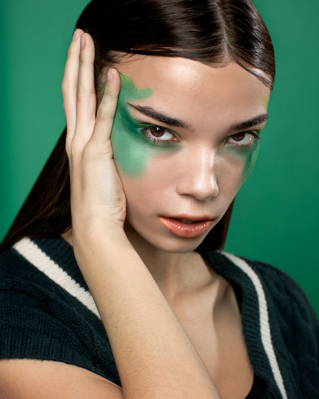
Complementary colors sit opposite each other on the color wheel (e.g., red and green, blue and orange, purple and yellow). When placed side by side, these colors create maximum contrast and make each other appear more vibrant. In makeup artistry, complementary colors have several powerful applications:
- Eye Enhancement: Eyeshadow in a shade complementary to your eye color will make your eyes appear more vibrant
- Blue eyes: Copper, bronze, and warm brown tones (orange-based)
- Green eyes: Purple, mauve, and burgundy tones
- Brown eyes: Navy blue and cobalt shades
- Hazel eyes: Deep purples and rich greens to enhance the multifaceted nature of hazel
- Color Correction: The principle of complementary colors is the foundation of color correction in makeup
- Red blemishes or rosacea: Green color corrector
- Blue-toned under-eye circles: Peach or orange corrector
- Yellow discoloration: Purple-toned products
Professional Tip: When using complementary colors, remember that a little goes a long way. The high contrast can be overwhelming if overdone. For everyday looks, consider using a muted or sheer version of the complementary color rather than a vivid one.
2. Analogous Colors
Analogous colors sit next to each other on the color wheel and create harmonious, cohesive looks when used together. This approach creates subtle dimension without stark contrast:
- Monochromatic Makeup: Using varying shades, tints, and tones of a single color family
- Example: A rose gold eye look with light pink on the lid, medium rose in the crease, and deeper berry in the outer corner
- Cohesive Color Stories: Creating harmony between different makeup elements
- Example: Peach blush paired with warm bronze eyeshadow and a coral lip
Professional Tip: Analogous color schemes are excellent for creating sophisticated, wearable makeup looks. To add interest to an analogous color scheme, incorporate varying textures (matte, satin, metallic) within the same color family.
3. Triadic Colors
Triadic colors are three colors equidistant from each other on the color wheel (forming a triangle). While bold and vibrant, they can create balanced looks when used thoughtfully:
- Editorial Makeup: Creating bold, artistic looks with intentional color placement
- Example: Purple eyeshadow, orange-toned blush, and a teal eyeliner accent
- Balanced Intensity: Using one color as the dominant shade and the others as accents
- Example: Bold red lip with subtle yellow-gold inner corner highlight and minimal blue-toned contour
Professional Tip: For wearable triadic color schemes, try using muted or desaturated versions of the colors, or focus on one bold color with subtle hints of the other two.
Undertones: The Secret to Perfect Color Matching
Beyond the basic color wheel, understanding undertones is perhaps the most critical color theory application in makeup artistry. Skin undertones fall into three primary categories:
- Warm Undertones: Golden, yellow, or peachy skin with greenish veins
- Cool Undertones: Pink, red, or bluish skin with blue or purple veins
- Neutral Undertones: A balance of warm and cool, often with veins that appear both blue and green
- Olive Undertones: A greenish or grayish tint that can exist within warm, cool, or neutral skin (often miscategorized)
Understanding undertones affects virtually every aspect of makeup application:
- Foundation and Concealer: Should match both skin depth and undertone for a seamless finish
- Blush Selection:
- Warm undertones: Peach, coral, warm pink
- Cool undertones: Berry, cool pink, rosy tones
- Neutral undertones: Can wear most blush colors with slight adjustments
- Olive undertones: Muted versions of both warm and cool tones often work best
- Lipstick Choices:
- Warm undertones: Orange-reds, brick reds, peachy nudes
- Cool undertones: Blue-reds, raspberry, pink-based nudes
- Neutral undertones: True reds, rose tones, balanced nudes
- Olive undertones: Muted tones with balanced undertones, avoiding overly bright options
Professional Tip: One of the most common makeup mistakes is ignoring undertones when selecting foundation. The perfect depth with the wrong undertone will always look "off" and create a mask-like effect. When testing foundation, always check the match in natural daylight.
Color Temperature and Intensity
Beyond basic color relationships, professional visagistes consider two additional dimensions of color:
1. Color Temperature
Colors are typically classified as warm (yellow, orange, red-based) or cool (blue, green, purple-based). Understanding this classification helps in creating specific effects:
- Depth and Dimension: Cool colors recede while warm colors advance
- Application: Using cooler tones in the crease and outer corner creates the illusion of depth
- Application: Warmer tones on the center of the lid bring that area forward
- Color Balance: Combining warm and cool tones creates visual interest
- Example: A cool-toned smoky eye paired with a warm peachy blush
2. Color Intensity
The saturation or vibrancy of a color significantly impacts its visual effect:
- High-Intensity Colors: Vibrant, saturated colors that draw attention
- Application: Using a vibrant color as a focal point (like a bold lip) while keeping other elements more subdued
- Low-Intensity Colors: Muted, desaturated, or pastel tones that create subtle effects
- Application: Creating depth with muted tones for a natural, sophisticated look
Professional Tip: When creating a makeup look, decide on a focal point and adjust the intensity of colors accordingly. For a bold lip, use more muted eye colors. For dramatic eyes, choose a more subdued lip color.
Practical Applications for Different Skin Tones
Color theory principles must be adapted to different skin tones for truly inclusive makeup artistry:
For Fair to Light Skin Tones
- High-contrast colors can appear more dramatic, so intensity may need to be adjusted
- Colors like deep berries and plums can create beautiful contrast without the harshness of black
- Warm bronzers need to be applied with a lighter hand to avoid appearing orange
For Medium Skin Tones
- Can generally wear a wide range of color intensities
- Jewel tones like emerald, sapphire, and amethyst create stunning effects
- Both warm and cool-toned blushes can work, depending on undertones
For Deep Skin Tones
- Vibrant, high-intensity colors showcase beautifully
- Pastel colors may need to be applied over a lighter base to achieve true color payoff
- Highlighters with gold, bronze, or copper undertones create the most flattering glow
- Bright blush colors like fuchsia, tangerine, and rich berries create gorgeous effects
Professional Tip: No color is off-limits for any skin tone—it's all about finding the right version of that color. For example, everyone can wear red lipstick, but the specific red (blue-based, orange-based, brown-based) that looks most flattering will vary.
Color Theory in Action: Creating Specific Effects
Professional visagistes use color theory strategically to create specific effects:
1. Color Theory for Corrective Makeup
Beyond basic color correction, subtle color theory applications can address specific facial features:
- For Close-Set Eyes: Using lighter colors on the inner corners and deeper colors on the outer corners creates the illusion of width
- For Thin Lips: Using a slightly lighter color in the center of the lips creates the illusion of fullness
- For Facial Asymmetry: Strategic placement of highlighting and contouring products can create balance
2. Color Theory for Age-Appropriate Makeup
How color is used should evolve with changing skin texture and tone:
- For Mature Skin: Satiny, light-reflecting finishes are generally more flattering than flat mattes or high-sparkle products
- For Textured Skin: Lower contrast between colors creates a more harmonious effect that doesn't emphasize texture
- For Changing Skin Undertones: As we age, skin often becomes more neutral or cool in undertone, requiring adjustments to foundation and color cosmetics
Did You Know?
Color theory has been applied to beauty practices for thousands of years! Ancient Egyptians were among the first documented visagistes, using color theory principles in their cosmetics. They created green eyeshadow from malachite and understood it enhanced their brown eyes—essentially utilizing complementary color theory millennia before it was formally documented. They also recognized that certain colors held specific symbolic and aesthetic properties, much like contemporary color psychology in makeup artistry.
Advanced Color Theory Concepts for Visagistes
For those looking to elevate their makeup artistry further, these advanced concepts offer new dimensions to explore:
1. Color Harmony and Dissonance
While color harmony (colors that work well together) is commonly discussed, intentional color dissonance—using colors that create tension—can create editorial and avant-garde effects. This technique is particularly relevant for fashion shoots, runway looks, and creative expression.
2. Color Context and Simultaneous Contrast
Colors appear differently depending on surrounding colors. This principle explains why the same eyeshadow can look different on various skin tones or when paired with different clothing colors. Understanding this helps in creating cohesive looks that consider the entire visual context.
3. Color Psychology
Different colors evoke different emotional responses and associations. Professional makeup artists consider the psychological impact of their color choices:
- Red: Passion, energy, confidence (perfect for power situations)
- Blue: Calm, trustworthiness, professionalism (excellent for business environments)
- Purple: Creativity, luxury, wisdom (ideal for artistic expressions)
- Green: Natural, balanced, harmonious (creates approachable looks)
Building Your Color Theory Intuition
While understanding color theory intellectually is important, developing an intuitive sense for color is equally valuable:
- Observe Natural Color Harmonies: Study color combinations in nature, art, and fashion that appeal to you
- Practice Color Mixing: Experiment with mixing different eyeshadows, lipsticks, or cream products to understand how colors interact
- Create Color Stories: Practice developing cohesive color palettes for different makeup looks and occasions
- Analyze Professional Work: Study the work of established makeup artists and identify their color theory applications
Final Thoughts
Color theory is the unsung hero of makeup artistry—the invisible framework that elevates application technique to true artistry. While it may seem technical at first, developing an understanding of color relationships becomes intuitive with practice and transforms how you approach makeup application.
The true mark of a professional visagiste isn't just technical skill but the thoughtful, intentional use of color to enhance natural beauty, express creativity, and create specific visual effects. Whether you're a professional makeup artist or an enthusiast looking to refine your skills, investing time in understanding color theory will yield endless creative possibilities and consistently superior results.
What color theory principle has most improved your makeup application? Share your experiences and questions in the comments below!


Comments (3)
Nina K
February 21, 2024This is such an informative article! I've always struggled with choosing the right eyeshadow colors for my green eyes, but now I understand why purple tones make them pop. The section on undertones was also incredibly helpful - I think I've been using the wrong foundation undertone for years!
Mark J
February 22, 2024As a makeup artist in training, this article is pure gold! I've been studying color theory in art school, but seeing it applied specifically to makeup is incredibly useful. The section on color temperature and how it affects facial dimension is something I'll definitely incorporate into my client work. Thank you!
Amara T
February 23, 2024I have deep skin with warm undertones and have always struggled with finding the right blush colors. Your advice on vibrant fuchsia and tangerine tones for deeper skin is spot on! I tried a bright coral blush yesterday after reading this and received so many compliments. It's amazing how much difference the right colors can make!
Leave a Comment